Por Cata Greloni Pierri
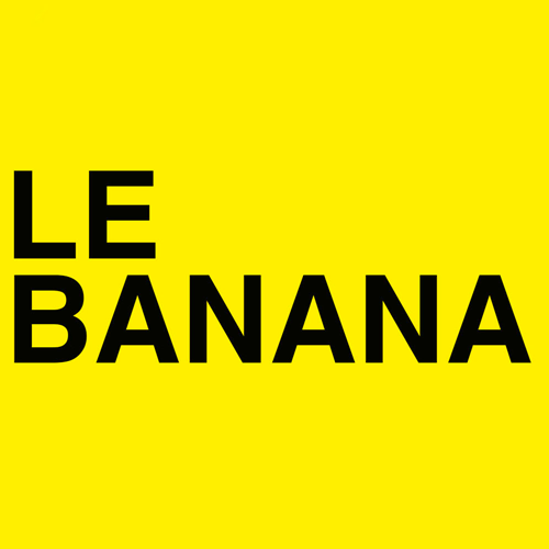
Some time ago, luxury brands’ shopping bags could be distinguished from miles away thanks to their unmistakable style; today, all the firms use the same typography so as to be easily recognized. Let’s analyze what’s happening.

How is it that logotypes of brands that are so different from one another such Yves Saint Laurent, Burberry and Balenciaga use now the same bold Sans-Serif font? It is likely that fashion fans have already seen this debate online and even in some memes, but John Whelan analized this phenomenon a little bit more deeply for the specialited site Business of Fashion.

But let’s bring some light for those who are in the dark about this. Many luxury brands, such as Balenciaga, Celine, Berluti and Balmain, among others, launched similar logotypes. These changes appeared in the last few years just when many of these brands changed their creative directors and started to change their traditional identity so as to be closer to streetstyle and ready to wear.

In dialogue with Hypebeast, creatives specialized in brands said that his trend could be explained by a prevailing “modern usefulness” that makes clean, versatile and legible logotypes better than any other. But, as Whelan says, homogeneity in a global creative industry as fashion is really dangerous.
.jpg)
Virgil Abloh referred to these times of change as a “rebirth of luxury brands in which each creative director can choose the future of the aesthetics of the firm”, something totally different to what happened in the past when these companies were managed by their founders, who belonged to a closed and anti democratic elite.

These firms were created by a selected group of white men who might be considered a patriarchy in modern language; and nowadays the prices of their luxury products don’t seem to be very democratic or affordable to anyone despite the changes that have been introduced by new managers and creative directors. And now that all these brands are stamping their logotypes with the same modern font, Sans Serif, they seem to be even less diverse and democratic.

It is true that in the past it was impossible to think that Louis Vuitton would have a black man as its artistic designer, or that there would be a woman leading Christian Dior or that Valentino would ever offer a Haute Couture fashion show as the one it offered last week. However, all these changes just show that these brands are still governed by a close conservative group that pretend to care about social justice.
Ver esta publicación en Instagram
John Whelan concludes his analysis saying that if the industry really wants to encourage an ideological diversity and not just the “diversity” seen between the inverted commas of Abloh, then it must think about what makes each of these luxury brands special and explore the unique features of their identity. “The way down to hell is always full of good intentions and the desire of reaching a revolutionary side can be easily seen in all these changes. However, for the fashion industry, hell could be 50 less dark and less ambivalent shades”, he says.
